Showing posts with label shading. Show all posts

Tuesday, March 5, 2013

How to Color Flowers

With the sun coming out a little more each day and buds starting to peek their green heads out, today's blog is in honor of the coming spring; how to color flowers! As usual, there is a lot of room for creativity here as flowers come in so many varieties, so I'll just touch on a few options.

As a general rule I color the center of the flowers yellow, sometimes with orange shades thrown in.

However, if I want to mix it up, I may make the flower itself yellow, and then make the center red or purple for a nice contrast.
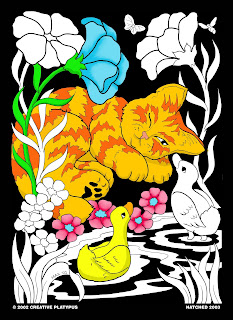


The flower petals themselves can be any color you choose. I choose my petal color based on if I want the flowers to stand out, compliment the scene, or fade into the background. Sometimes I'll just throw in a blue flower because my poster needs the color blue in it...
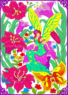


If the flower is a focal point, I like to use similar or complementary colors to give the petals some variety and depth. For example, I'll add shading to the center of the flower (such as a darker pink/purple) to create a more 3-D appearance. I'll also add lighter colors to give it highlights...

I may also just switch up the colors of the petals to make it more visually interesting...


However you like to color em, I hope you get to enjoy the beauty of these spring blooms both in your posters and in nature! Happy (almost) Spring!

Erin

Monday, November 12, 2012

Layering and Shading With Markers

Welcome back, hope everyone has had a great Veteran's Day and great weekend! Today's blog is about how to build up colors and shading using markers. This can be tricky depending on your markers, how many colors you have to choose from, and the type of paper you're coloring on. So we'll just go over the basics and then have you experiment and play around with it.
  • First of all, I always keep a scratch piece of paper next to my poster to test out any layering ideas I have before committing to my poster.
  • Secondly, I start with my light colors and then work darker. Can't go back once you color too dark.
  • I have 3 options when choosing which color to shade with. If I have a darker version of the same color, I'll use that (e.g. dark brown when shading a light brown object). If not, I'll layer and shade by using analogous colors (these are similar colors next to each other on the color wheel). So if I'm shading a yellow object, I'd shade by adding a layer of orange. Red object-purple shading. You get the idea right? Another option is to shade by layering with a gray marker. 
Like I said before, feel free to experiment with how to layer each color on that piece of scratch paper. Play around with adding layers of color while the marker is still wet on the page (for more blending between the light and dark color, you can go back over with the lighter marker) or see if you like it better dry. Just be careful to not scrub at the paper while its still wet if it looks like its ruining the paper.

Good luck with your layering, let me know how it's going or ask me a question in the comment section below. Have a great week!

Erin

Thursday, November 8, 2012

Q&A: More about shading!

Hi again, thanks for joining me on another lovely Monday :)  Today's blog is in response to a question posed by Amber the other day. So here we go!

Question: "At the end of the video [Santa timelapse] you went over some spots (like the blue bag) with a darker shade to add shading. I read the post on how you did shading on the bridge, but I'd like to hear more about how you add more organic looking shading like you did on Santa's bag"

Answer: First, always pick where the light is coming from. Imagine where the light would hit, and what would be cast in shadow. This gets easier with practice. I'll go over some poster examples, but first lets just look at the basic shading of a rounded object. 
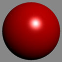
You'll notice three different basic shades on this ball: a whitish highlight, red, and black shading. Following this idea, you can add shading to any objects in your posters, understanding that you'll have a lighter spot where the light directly hits, midtones, and then a darker area where the curvature of your object (in this case, the roundness of the ball) puts the rest of the item in shadow.

Check out my shading for Carnival Unicorn.
  • I chose to have my light source shining from the top right.
  • I highlighted all along the top lines of the unicorn (light pink or left it white) as this was closest to my light source.
  • I assume that its body is rounded, so like the ball mentioned before, everything underneath would be cast in shadow. I shade the lower lines of the unicorn with a darker purple along the belly and underside of each leg. The body of the horse also casts shadows on the legs as well.

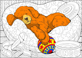
Then we have the poster Pup
  • The light is shining from the top right.
  • I add shadows to his belly, under his paws, ears, and side of the face where his nose would block out the light.
  • I also add a slightly darker brown to the lines in his fur, just to give the poster a little more depth. The more shades of one color you have (brown in this case), the more realistic and deeper the poster.

To directly answer Amber's question in regards to Santa's bag, I first pictured that the bottom of the bag would be cast in shadow as it was a rounded object. I then shaded along the lines of the bag as each fold or bulge would cast a shadow on the fabric directly below it. For even more depth, I could have added a lighter blue for a highlight wherever the fabric bulged out, as well as the top of the bag (closest to my light source).

Finally, I want to mention one more trick to shading... Don't forget that some objects will cast shadows on the objects around them. In this case of Turtle, the light shining from above would create a shadow on the sand below him. 

Hopefully I answered the question clearly enough, please let me know if further information is needed in the comments below or if any new questions arise. Thanks for tuning in!

Erin


Monday, October 29, 2012

Add Shading To Your Posters with These Easy Tips

Hello again! So last time we covered 2 color tricks to make your Stuff2Color poster pop. This time we'll learn how to create a 3-D look to make your poster pop off the page. So follow along with me as I color the giant line art poster "Country Bridge". We'll just focus on the bridge itself for now.

So the first thing to do when shading a poster is to figure out where the light is coming from. If its a scenery like this one and the sun isn't drawn in, I just put in my own imaginary sun to help guide my shading. In this case, the light is directly opposite of us, so the light would be hitting the other side of the bridge, leaving our visible side in shadow. Now grab three shades of brown, or whichever color you want to make the bridge. You'll need a light, medium, and dark pen, pencil, or crayon (hopefully you have a bunch of colored pencils or markers to choose three shades from).

Start by highlighting the pieces of wood that get the most sun with your lightest shade, in this case I highlighted the very tops of each board and the planks across the bridge since the sun would be shining right down on them.


Then I color my darkest brown where my darkest shadows will be, the wood facing away from the sun, as well as the posts hidden under the bridge (they won't be getting much sunlight at all).

Finally, I take my middle brown to color in the rest. This is for the wood that will be getting some sun, but not as much as our highlighted boards. And there you have your 3-dimensional bridge.

No shading on this one. Notice the difference!
Lets compare it to a bridge that I colored all in the same brown without shading....Not nearly as much fun to look at!

And now its time for your show-and-tell. I can't wait to see your 3-D masterpieces! And as always, feel free to ask any questions or bring up any topics you'd like to talk about in the comment section below. See ya soon!

Erin