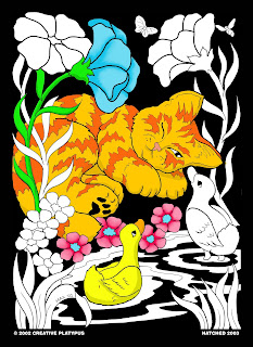
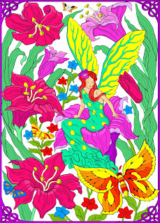
As a general rule I color the center of the flowers yellow, sometimes with orange shades thrown in.

However, if I want to mix it up, I may make the flower itself yellow, and then make the center red or purple for a nice contrast.

The flower petals themselves can be any color you choose. I choose my petal color based on if I want the flowers to stand out, compliment the scene, or fade into the background. Sometimes I'll just throw in a blue flower because my poster needs the color blue in it...
 If the flower is a focal point, I like to use similar or complementary colors to give the petals some variety and depth. For example, I'll add shading to the center of the flower (such as a darker pink/purple) to create a more 3-D appearance. I'll also add lighter colors to give it highlights...
I may also just switch up the colors of the petals to make it more visually interesting...

However you like to color em, I hope you get to enjoy the beauty of these spring blooms both in your posters and in nature! Happy (almost) Spring!
Erin

No comments:
Post a Comment